For the Love of Icons
Posted Under: Education | Written by James Prola
![]()
This might singlehandedly make me a nerd but I absolutely love icons…good icons at least. Perhaps it’s my partiality towards images rather than text but a well designed icon is like a mint ice-cream cone on a hot summer day.
To be clear, we are not talking about clipart (please don’t use clipart). We, and many others, associate clip art with terrible design and repulsive color schemes. They tend to go very well with fanny packs and high fructose corn syrup. We don’t recommend them.
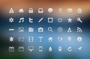
Say more with less
Icons acts as visual signifiers that create a shorthand to communicate with little or no text. When used correctly (usually as a happy family) they can greatly enhance your user interface. A well crafted icon set is clear, clean and immediately recognizable at various sizes. They will save your user time, keep them on track, and might even make them smile. Here are some examples:
![]()
A long rich history
Symbols, as we understand them on computers, are an extension of visual items from print. There were ornate elements since the invention of the printing press. Admittedly, many of the elements in print were purely ornate in nature but we can go even further back to the premise of the basic pictogram.
It would almost seem like pictograms even evolved into language all over the world. The use of icons on a website to represent a concept is almost like going back to the roots of language itself. Food for thought!
Evolving on the screen
Digital based icons are only 30 years old and have come along way since the first consumer computer in 1981. Thanks to Apple we can create an abbreviated history of computer (trash) icons:
![]()
You may have noticed a dramatic design shift within the last year that has stirred up a bunch of buzz. The change is from realism (actually called skeuomorphism) to flat design. If you’re not familiar with what I’m talking about just compare the realistic 2001 Apple trash can above to the trash can icons made between 2013 and 2014 seen below.
![]() I’m personally a fan of the simple because its a shift towards…well simplicity. It’s a win in my book any time you can communicate more (or at least the same) through less. Here are some more examples of skeuomorphism (left) vs flat design (right):
I’m personally a fan of the simple because its a shift towards…well simplicity. It’s a win in my book any time you can communicate more (or at least the same) through less. Here are some more examples of skeuomorphism (left) vs flat design (right):


Free? Yes, Please.
On a final note I’d like to emphasize that there is only one thing better than a well crafted icon — it’s a free well crafted icon…so here are a few goodies from around the web:
dribbble.com/visualidiot
http://www.bestpsdfreebies.com/
http://modern.squintongreen.com/
– The Immersus Team