The Process
Accessible, Interactive & Updatable
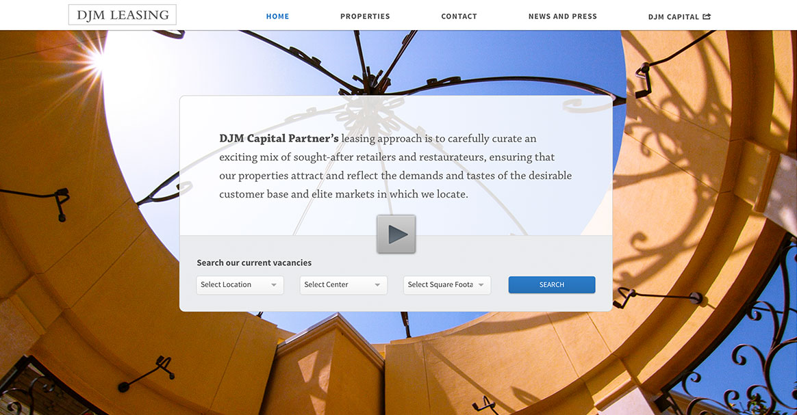
While designing and building out djmleasing.com, our team was always mindful of a handful of items: how easy the site would be to navigate, how easy it would be to update by the client, how effective it would be at communicating the goals of the site to the end user.
We started by establishing with the client what they hoped to accomplish with the site. Their ultimate goal was to showcase vacancies at their various property locations and get those vacancies filled. Their goals also included the desire to maintain a level of quality in presentation that made it easy to get basic information about each property center.
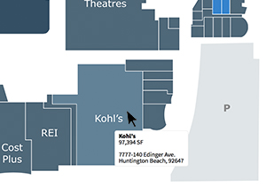 It was established fairly early on that one way of showcasing the various vacancies would be to utilize an interactive property map for each location. Our studio built custom interactive site maps with specially designed SVGs (Scalable Vector Graphics) that were integrated with WordPress, enabling the client to easily update said maps into the future. Because these maps are built as SVGs, it also means that they are fully vector based and will render in full crisp detail regardless of the pixel density of the display they are viewed on (meaning they are retina ready and pixel independent).
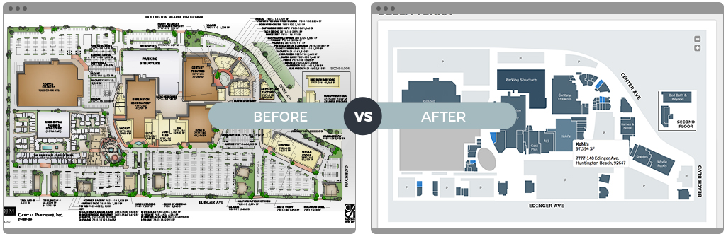
We took pre-existing site maps and updated, simplified, and adapted them for the site.
Responsive & Intuitive
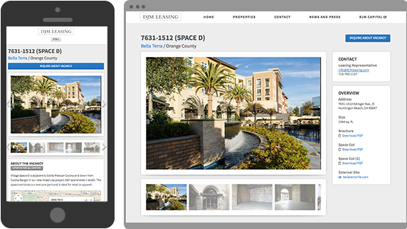
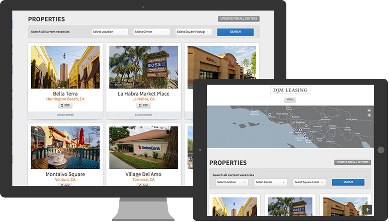
Everything about this site was designed to make it easy to get to information quickly on every screen size. Regardless of whether you’re viewing the site on a mobile device or a giant desktop display, everything is laid out to make navigation intuitive and content accessible.
As you navigate through the site, nearly every page has at least two ways (or more) to navigate there and we paid special attention to what worked on mobile and what would not. The special designed interactive SVG maps mentioned early, for example, were not the optimum mode of navigating vacancies on mobile devices due to size limitations. Due to this we designed a list view which requires less data to load and is a more direct way to navigate the information on a small display.
The Complete Package
With the increasing proliferation of high-density (or “retina”) displays, we also took great care to ensure that every aspect of the site (buttons, graphics, icons, logos, and so on) would display correctly while also being mindful of load times.
Another major consideration for this site was making sure that every part of the site was easily updatable. To this end, we built the entire site on a custom WordPress theme. Everything from the navigation, copy on every page, to adding and removing vacancies. All details on those pages is editable via WordPress.
As part of our work with the client on this project, we also assist with on-going maintenance of the site and ensure that everything continues to run smoothly and securely.
Exploring the Craftsmanship
Our focus on details is evident throughout the site. We really care about all aspects of the experience including the typography, accessibility, visual presentation, even the effectiveness of the buttons on the page. This attention to details also carried over to how the content is presented on various screen sizes and resolutions. What looks good on a desktop computer may not be appropriate for a mobile phone and we took that into consideration. We care about good content and the context it is shown to the end user.

The site was designed to be easily updated by the client, is fully responsive and optimized for mobile, includes advanced property search functionality, and is easy to navigate.