The Relaunch
Web Design and Development
We’ve been designing church websites for over eight years but each and every one requires a unique approach in order to solve specific problems and alleviate user “pain”. Meanwhile, we always aim to establish the church’s online presence as approachable, user friendly, and trustworthy. Although there are a number of cheap (and even free) church themes on the market, we have found that each organization and community has precise needs that merit custom design – the website redesign for Garden City Church was no different.

At Immersus Media, a constant objective of ours is making the new website easy to use for our clients. Their previous website was cumbersome to update and, at times, clunky to even navigate. It was also on a platform that was not mobile friendly. The visuals were hobbled together and didn’t have direction. When relaunching websites we ensure a top level of visual design to properly represent and match the professionalism of the organization.
Responsive Design
In establishing the new site as a hub for the church community, our goal was to make relevant content more readily available. Some examples of this include: visual hierarchy crafted to funnel users to an appropriate location or action, user interface redesign for improved access, and interaction of key items (such as sermons, event calendar, volunteer opportunities, and promotional content).
We were charged with targeting the relatively young, tech savvy demographic of the Silicon Valley. In order to remain relevant to this demographic it is essential to create a fully responsive site that looks good on anything from mobile devices to large desktop screens. Large relevant images were used on each page and we aimed to eliminate any possible “fluff” on each page.

Optimizing the Calendar
When coming up with specific solutions, we sometimes integrate established third party solutions. This can be more cost effective for the client while preventing us from “recreating the wheel”. As a creative agency, it is our responsibility to not only identify a reliable solution but to modify and integrate so that the solution works visually and functionally within our custom site, which in the case of Garden City Church applied to their calendar.
Starting with the the Events Calendar Pro plugin, we customized its size and colors to fit within our layout and developed a full responsive option for properly displaying on mobile devices. We also set up the site so that the latest calendar event is pulled to a section on the home page.

This illustrates the responsive design that Immersus Media added to the calendar feature.
Custom Sermon Section
Sermons are an important part of a modern church website. For this client, we crafted a custom experience to ensure that the user has access to stream, download, sort, and search the sermon content that they need in a user friendly way. It was also important that the latest sermon automatically appears on the homepage with basic details and a link to the individual sermon page.
We started by building a sermons page which pulled from a custom post type that was sortable by sermon series or speaker. This allows the client to easily add content to this section of the site. We also organized the sermons by date in a table that is designed to be optimized for mobile viewing. The site is also set up to produce an RSS feed specifically set-up to connect to iTunes for a podcast, so people can easily subscribe to sermons from within iTunes.
Each individual sermon page has the pertinent information, the ability to listen to the full audio sermon directly in the browser, and the ability to directly download the sermon message itself. These pages also have easy to use share function custom built for the page in order to match the site’s aesthetic and allow for a user to easily post on Facebook, Twitter and other social sites.

Developing a Safe and Useful Space
As part of establishing an comfortable and open environment within the site, the client wanted the ability to showcase what they called “stories”, essentially small snippets into peoples’ lives at Garden City Church about how God is alive and active. The goal was to keep these pages simple, clean, and spacious. Each page simply has a content section, easy to use share tool, and a sidebar with other stories.
We, again, built a custom post type so that the client could easily update this section of the website including automatically showing the latest featured story excerpt on the home page.

Top Level Items
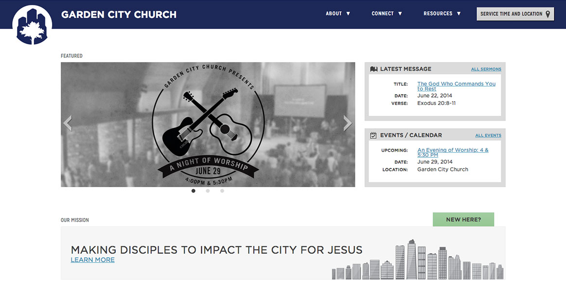
One of the goals of the home page of the website was to make it evident what was being promoted by the church – whether it be upcoming sermon series, events, or opportunities – but we wanted to keep the page as streamlined as possible so we ended up deciding upon a simple slider. The slider was built on Flexslider and integrated into WordPress so the client could easily update it themselves.
Taking user experience into consideration we often assess a variety of user types to determine common wants and needs for each page. As a result of our assessment and experience, we included ‘services times and location’ button in top bar (when clicked activates a panel that slides in along the right with details that someone new might want at a glance) and added a “I’m new here“ button on home-page.
In order to make it easy for volunteers sign up we created a ‘serve page‘ with a visual listing of various volunteer opportunities. When the user selects an item they are directed to a contact form that is pre-populated according the the item they selected. The form then shows additional form fields as needed conditionally depending on which area they selected to serve.

Acts 29 Network
Our client wanted to make it clear that they were part of Acts 29 Network, a broader church organization. The most streamlined and clear way to achieve this was to create a custom Acts 29 logo and add it to the footer which that appears on every page. This is often the solution for organizations with closely associated companies or products that they want to cross promote.
User Experience
There are several other additional items that allowed for a positive user experience and a highly functional hub of information. We created a section for recommended reading that was easy to use and update. A list of visually accented reading suggestions are set to display in a grid with links to Amazon or other appropriate vendors.
We emphasized clean typography throughout with a strong and relevant color palette. Special attention was paid to readability on the site and how the type was balanced on each page including line-height, padding, and color contrast. The headings on site are loading via a server loaded @font-face of Mission Gothic found at http://www.losttype.com/font/?name=missiongothic. The body text is loading a web version of the famous font Gotham via Cloud.typography, the online service of Hoefler&Co.

Designed by Alan Dowling, this Summer Sermon Series graphic was inspired by his trips to the beach, looking down at his feet getting covered in sand and the incoming tide.
Collateral Design
As a creative agency, Immersus Media offers much more than web design and development. Our team of experts can tackle all forms of visual design. This include identity design, custom info-graphics, custom illustration, graphic design, motion graphics animation, and collateral design such as business card design, online advertisement design, print advertisement design, and various other print and digital mediums.

These designs were to promote the monthly church prayer meeting. As Lead designer on the project, Alan Dowling wanted to represent communication between God and mankind.
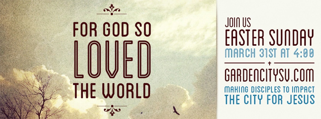
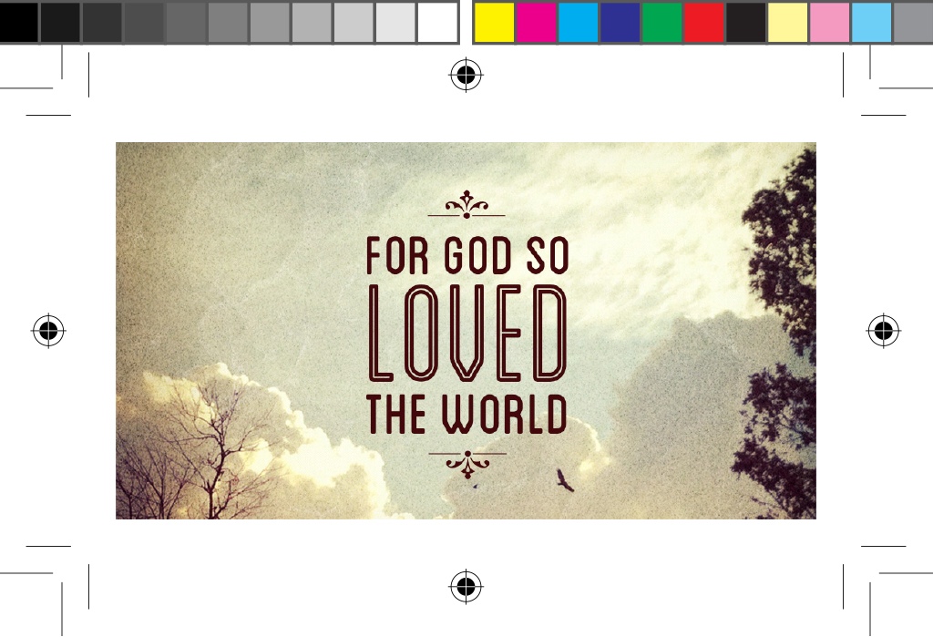
Easter Sunday Print Design
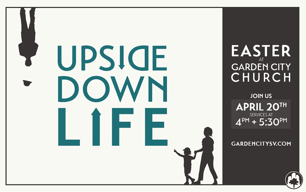
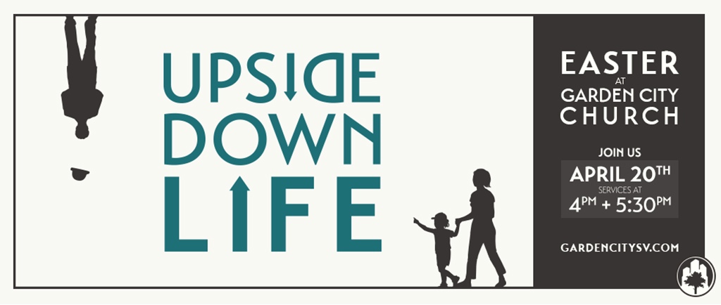
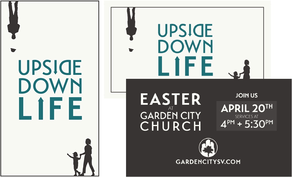
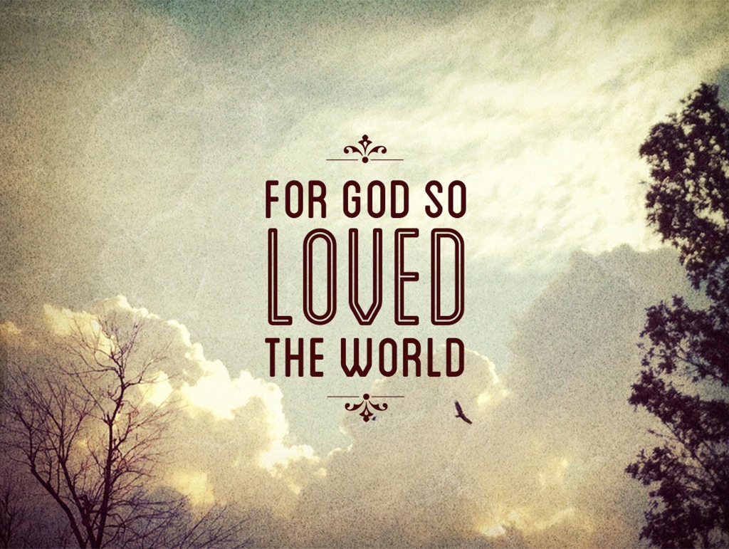
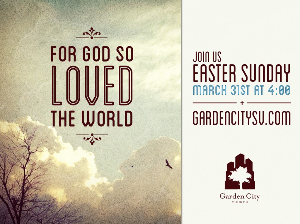
It has been a blast designing the annual promotion for the Church Easter Services. As you can see below we have created a variety of formats in order to optimize the design for various applications such as post cards, business cards, keynote, Facebook banner, and website banner. The focus of the 2013 design, entitled “For God So Loved The World”, was clean typography and a home grown feeling meshed with the immensity of the heavens. Our Easter 2014 graphic design was intended to contain simple visuals, a visual play on words, and something that would cause people to give the design a second look.

Counter Culture Series
This design was created for a sermon series about the Beatitudes. The objective was to show a very simple visual that communicated the “counter culture” of what Jesus preached.

Artist Collective Poster
This custom poster design was made for a special performance during an all church retreat. The performance was made up of people primarily from the Artist Collective, a group of talented and dedicated artists within the organization. Our vision here is derived from the increasingly popular trend of taking photos of items that people are packing on a trip, have in their pockets, etc. The visuals are designed to show various tools of artists. The aesthetic was intended to be reminiscent of something vintage from the 1950s or 1960s mixed with a modern flair and personal twist. Small details were added for humor such as a the ACGC logo (looks like a sticker for the band AC/DC) or the modified logo on the Macbook Pro made to be a pear with a bite out of it instead of an apple.