Responsive Design & Why It’s Important
Posted Under: Education | Written by James Prola
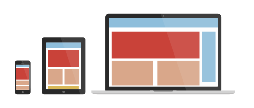
The Plethora of Devices
If you’re anything like me, you unabashedly depend on your smartphone. I use my mobile device more than any other digital device, from pricing a new car to finding a good restaurant. The thing is, so does a lot of the world and probably the majority of your clients. According to a Netbiscuits survey, the vast majority of mobile web users have switched to a competitors better website. What used to be luxury has now become essential. Websites need to look good and work well on any screen. This is what we refer to as “responsive design” — an approach to website design and development that enables the content, layout, and visuals to automatically adjust to the users screen size, resolution, orientation, and even behavior.
Where We’re At
As technology progresses and hundreds of new devices hit the market, it has quickly become impossible for web-designers to create screen specific versions for most websites.Your website needs to look good on a mobile device or you will simply lose your users.
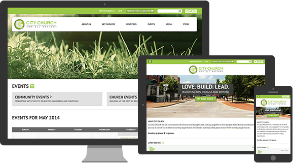
Luckily Ethan Marcotte and some other smart people came up with an approach to design that makes a website automatically respond to the viewers screen size. That means one website can look great and function properly across all devices. We put together the following animation to illustrate how one of our recently designed sites automatically adapts to the various screen sizes and orientations.
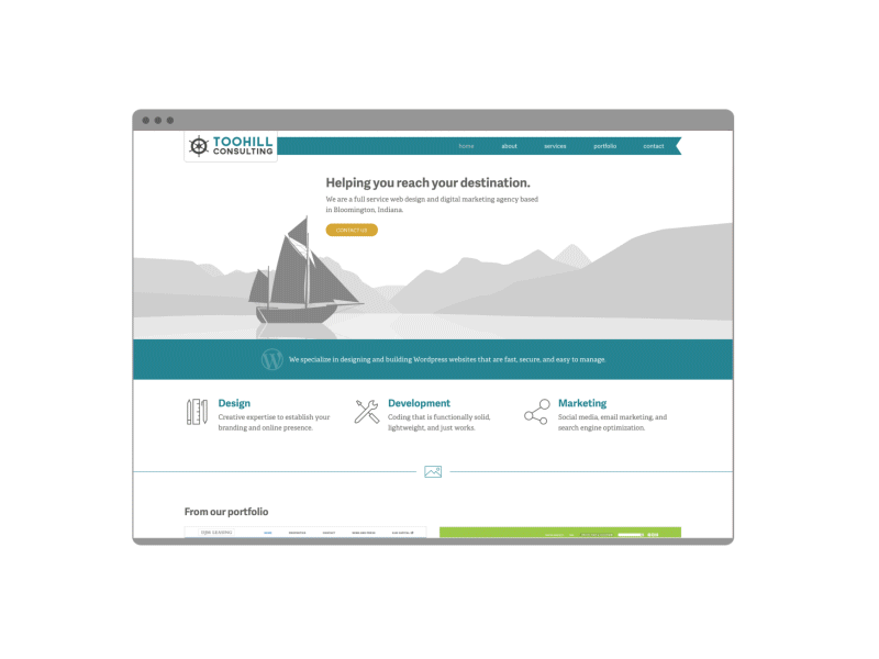
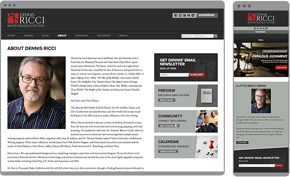
http://dennisricci.com/
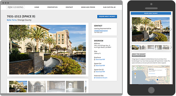
http://djmleasing.com/
Under the Hood
Although best practices are still emerging, there are several design and development aspects of a website with responsive design:
1Adjustable Screen Resolution – the website adjusts appropriately no matter what the orientation, size or pixel density of the screen.
2Fluid Layout – the layout grid can scale up and down according to the screen size and orientation.
3Custom Layout Structure – The structure of the layout can be altered altogether to ensure a better user experience on any given screen size.
4Flexible Images – The display size of the images adjust to the screen size.
5Responsive Images – As images scale up and down they actually swap out with larger or smaller versions. This is to maintain good resolution and not hinder load time on smaller devices.
6Media Queries – Through CSS and/or Javascript the site is programed to know what screen size the user has and to change layout according to pre-specified values.
7Content Visibility – Smaller screens don’t afford the luxury of including the amount of content displayed on a large desktop screen. Some aspects of the page will need to be hidden as orientation and screen size is reduced. User behavior should be assessed. For example, a mobile device user is probably on the go and may be looking for different information than a desktop user.
8User Needs – User Interface changes need to take place to compensate for user behavior changes. The difference between operating with a cursor and operating with a finger is substantial. For example, buttons need to be larger for fingers and hover over states need to be presented in a different way.
Mobile First
It is commonly held that designing first for a mobile layout is the best approach to web design. Smaller screens can easily become overloaded with information if design isn’t percolated down to its essential elements. Starting a new web design project by doing the mobile version ensures that the large format screen version will contain only the most important information. It is a methodology of cutting out the fat.
Conclusion
We are entering a new era of web design where a well designed website can respond and adjust to the needs of the user and the device that they are using. Users now expect a good experience regardless of what device they use and when they don’t get it they go elsewhere. Customers don’t want to spend the time scrolling, panning and resizing a website in order to find pertinent information.
Your website needs to look good and work well on any screen or you will simply lose users. This is avoidable, keep your customers happy and make sure that your website has responsive design.
Additional Resources
What The Heck Is Responsive Web Design? (@johnpolacek)
http://johnpolacek.github.io/scrolldeck.js/decks/responsive
– An interactive (and entertaining) guide to responsive design
Responsive Web Design (@beep)
http://johnpolacek.github.io/scrolldeck.js/decks/responsive
– A Very Thorough, yet short, book for those web design professionals
Awwwards Responsive Web Design Gallery (@awwwards)
http://www.awwwards.com/websites/responsive-design
– Best website examples with responsive design