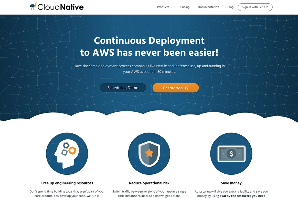
Cross Comparison
For some organizations it is difficult to stomach the cost of a re-design without really understanding the difference it will make. We like to show comparisons like the following to give our future clients an idea of the huge difference a re-design can make. Other improvements with the user interface and information architecture are less visual but also make a major impact on user experience.
A Modern Approach
Good design goes a long way by instantly establishing credibility with viewers. As essential as it may be it is also key to establish a pleasant user flow by building in good functionality such as responsive design, that allows the site to be property viewed across all devices.
Visual Theme
Establishing a strong visual theme to carry throughout a site makes it feel uniform and purposeful. This includes establishing a visual hierarchy and other consistent cues or rules to apply to the entire site.
We’re strong proponents of keeping a site’s visuals cohesive throughout. Anyone can make one component look good; we believe in making those components look good together.


