Web & Collateral Design
Website Design
More and more, professionals and individuals alike are needing websites to represent their resume, services, products, portfolios and more. We’ve built custom websites for a vast array of photographers, educators, authors, councilors, speakers and bloggers. It’s becoming standard for these types of professionals to establish a cohesive brand, and carve out a little space on the internet. We are here to make that happen with an exceptional level of quality.
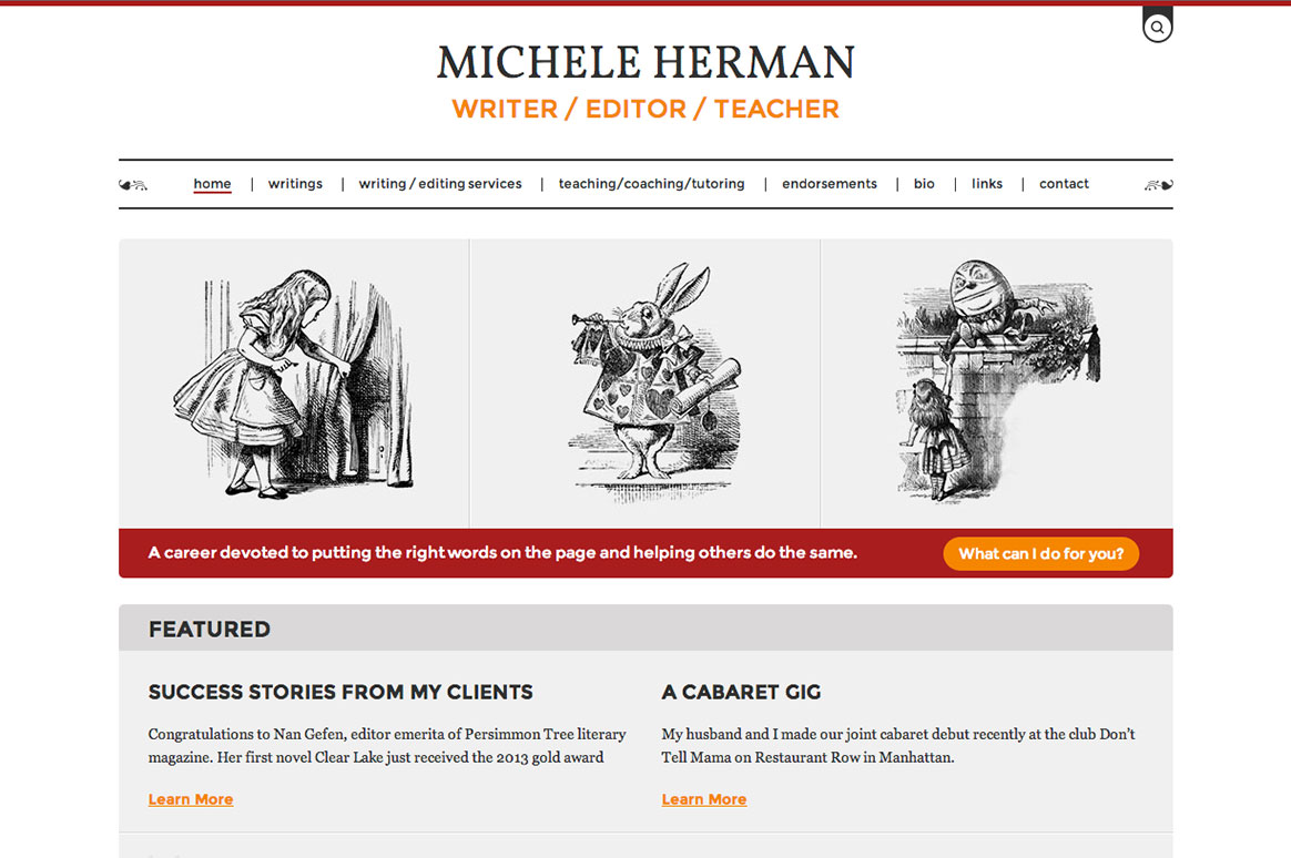
It was an amazing process crafting a custom website for Michele Herman, a successful writer, editor, and teacher. Aiming to create a home where her brand is fully expressed, we helped refine a color palette, type face, and distinct visual style. Don’t let the seemingly simple layout deceive you. There is intentionality in all aspects of the design in order to create a clean and open environment. There should be room to breathe with a site like this. Notice the distinct call to action orange color used sparingly throughout, and the elegance in the subtle floral accent pattern, and the pen and ink illustrations.
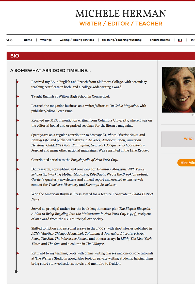
Every aspect of a website should be designed to communicate. Layout should maintain flow, be it a mobile device or a large desktop. As you can see below, slight layout modifications are made with the responsive design in order to optimize for an ideal user experience in various formats.
Collateral Design
Carrying over identity design to all forms of advertisements is an essential piece of re-establishing the brand with customers. This helps create brand recognition and loyalty.
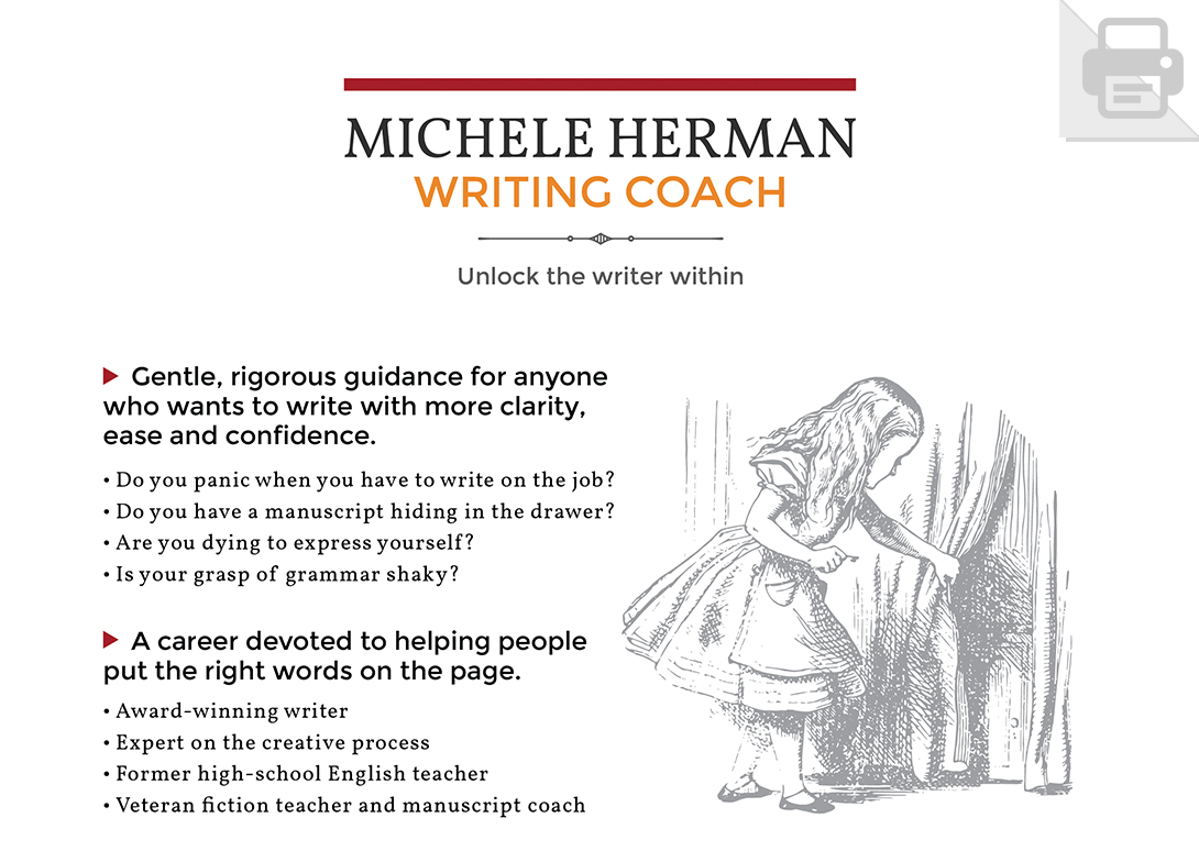
On the right you’ll see an example of a writing coach poster we crafted for Michele. The elements included in this print design were included to clearly lay out the available services, express her personality, and establishing credibly with customer quotes in a clutter free and easily recognizable fashion.
Business Card Design
Through a long and detail oriented process with several iterations of refinement, we created Michele’s business cards. Again, don’t be deceived by the simplicity. The font selection, illustration placement, header thickness, and font size are key elements that take hours or experimentation in order to make full use of the space.
Clean & Timeless
Both Michele and our team are proud of our work on this brand, website, and collateral design. The results are timeless and clean, while communicating professionalism and strength. As you can see in this final image there are several seamless design elements that add personality to a highly functional user interface.

